

This summer, we implemented the new version of the data processing tool after a complete rewrite of its code.
Let’s start with user-friendliness, as the differences between our tool and the usual spreadsheets may have confused some people. Let’s face it: our tool is not a spreadsheet, as it forces data to be organized in columns. Without drastically changing its interface, we have made some fifteen ergonomic improvements. In a word: the tool is more accomplished.
Let’s move on to the new features:
- Cutting and pasting from the previous version was, at best, difficult to use! We’ve completely reworked it. It is now possible to select cells by dragging, or by using the Shift/Maj key at the same time as clicking with the mouse. Then use the classic CTRL-C/X/V or the top-left menu. The only fly in the ointment is that Firefox is (too) secure; to use cut-and-paste in this browser, you need to authorize it via a setting that we explain in a message in case of blockage.
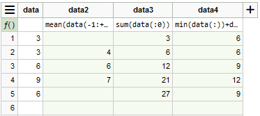
- We’ve allowed Math.js functions using a list of values to be used in column formulas. To select values within a data column, use the syntax data(n:m), where n and m are RELATIVE indices relative to the current line. If n is omitted, the list starts at the first row of the column; if m is omitted, the list ends at the last non-empty row of the column. Examples to explain:
- mean(data(-1:+1)) calculates a moving average on the data column with 3 values;
- sum(data(:0)) calculates the cumulative sum on the data column;
- min(data(:)) returns the minimum value of the data column.
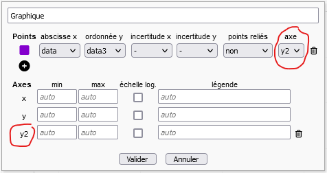
- You can now add 2 y-axes to a graph. In the graph parameters, click on the (+) below the axes: a y2 axis appears. For each series of points plotted, you can choose whether to use the y or y2 axis.
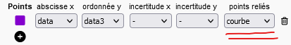
- It is now possible to connect experimental points by segments or a smoothed curve in the graphs. We were very reluctant to add this feature, which some people had requested. In the end, it has been added, although there is a risk of confusion between a smoothed curve and a model defined by a parametric function: this will be an opportunity to discuss the difference between the two with your students!
- We have modified the distance indicators between a parametric function and experimental points. If ALL experimental points have an uncertainty (in y or x, the uncertainty in x being transferred to y according to the slope of the function), X² is used; otherwise, sigma is used. To find out which formula has been applied and the number of points used to calculate the indicator, position your mouse over a calculated value: a speech bubble will provide you with this information. Please note: once a parametric function has been defined, if several sets of points are displayed, you must now select the points it models. Only the distance between these points and the model is calculated.

- The most important new feature is the automatic adjustment of parameterized functions to experimental points. By default, this function is not activated for students. In fact, manual adjustment is a pedagogical feature of our tool: by manually adjusting parameters, students can see their effect on the model and understand their scope. But for some students who have understood all this, adjustment can seem time-consuming. Here’s how it works :
- The teacher authorizes automatic adjustment at the mission level (“Missions” tab, edit mission, option accessible at the beginning of “Report structure and contents”: “Authorize automatic adjustment for all dataset labdocs”).
- For each parameterized function, the student is then presented with a new button for automatic adjustment.
- If a parameter is not to be adjusted, click on its name to fix it (same for releasing it).
- It may sometimes be necessary to give an initial value to the parameters for the fitting algorithm to converge.
